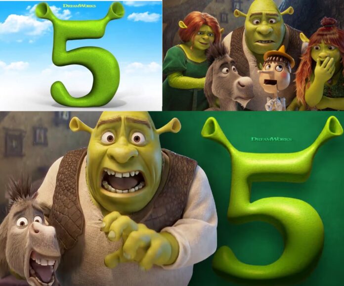
The teaser for Shrek 5 might use a different visual design for the franchise’s characters than what fans are used to, but the public backlash isn’t warranted.
On Feb. 27, Universal Pictures released the first teaser for the highly anticipated Shrek 5, which revealed new designs for characters like Shrek, Fiona and Donkey. While the differences might be difficult to spot for those that aren’t Shrek aficionados, side-by-side comparisons make the alterations a bit easier to detect.
In the teaser, we can see that Shrek’s eyes have been moved closer together and his nose and mouth have been made a little larger. His face is visibly wrinklier, though this is likely a design choice meant to represent the 15 years that have passed since 2010’s Shrek Forever After.
Donkey has seemingly received an even larger redesign than his titular counterpart, sporting larger eyes that are also closer together, larger teeth with a larger mouth in general, a more prominent tuft of hair growing from his chin and altered facial proportions.
While the look of the characters has certainly changed, they don’t look worse. In fact, based on just the 27-second teaser alone, it appears that the characters have gotten more expressive in their facial animations, able to portray a wider array of emotions than their predecessors from two decades ago.
This shouldn’t come as a surprise. After all, animation technology has naturally improved since Shrek’s last outing, allowing the artists at DreamWorks Animation more creative liberty in how they allow Shrek and his friends to express themselves. This isn’t meant to be a critique of the characters’ old designs; rather, it’s simply pointing out that animation has evolved over time and the changes to the characters’ 2025 designs reflect that evolution. Shrek’s old look worked based on animation equipment that was available in the 2000s, but two decades later, it should be expected that the animation style would improve in some fashion.
Unfortunately, many fans online have not been receptive to these changes, with some going so far as to compare Shrek 5’s new look to the original scrapped design of the titular character in the first Sonic the Hedgehog movie. The original design for Sonic, which is often referred to as “Ugly Sonic” by the online community, caused great amounts of backlash upon its initial reveal, eventually causing Paramount Pictures to delay the movie as the production team redesigned the character from scratch and raced to reanimate the character throughout every scene in the movie. It was an incredible testament of a company listening to fan feedback, causing them to fix a design that was truly flawed and disturbing.
There’s a major difference here though, which is that Shrek’s new look isn’t flawed nor disturbing. Sonic’s original look wasn’t just different from his in-game appearances — it was terrifying to look at, complete with beady little eyes, white fur on his hands rather than the gloves the character traditionally wore, and off-putting human teeth. It was a disgusting abomination that attempted to fuse the beloved video game character with human proportions, and it just ended up as nightmare fuel. It was also a betrayal to long-time fans, who expected the character to be a loving interpretation of the in-game design rather than being arbitrarily changed.
Note that Sonic’s new design doesn’t look exactly like his in-game counterpart either — he’s got lifelike quills covering his body and eyes that aren’t conjoined at the middle, unlike his design from the games. Yet, because it’s clear that the animators took much more inspiration from Sonic’s in-game design in this iteration, it doesn’t need to look exactly the same. It’s simply an evolution of the look that fans already know and love.
That’s the exact case with Shrek and his friends’ new appearances. They don’t fundamentally destroy the original design like Sonic’s original look did; instead, they enhance the qualities portrayed by the designs that fans have grown accustomed to. As I mentioned earlier, it looks like Shrek’s new look will allow him to become far more expressive, which is an exciting step forward for the character even if he’s undergone a slight redesign.
Don’t get me wrong. Fans are absolutely allowed to prefer one iteration of Shrek over the other. There’s no “objectively better” version here; it’s entirely up to every individual person which style they prefer. But to pretend that Shrek’s new look is somehow a huge betrayal of the character anywhere close to Sonic’s original movie design is simply disingenuous and frankly insulting to the animators working on Shrek 5. You have every right to prefer Shrek’s old look, but let’s not act like this is the end of the world or attempt to pressure DreamWorks into bringing back the old design.
Shrek 5’s new look might be different than what you were expecting, but don’t blow it out of proportion — the movie looks totally fine, and in many ways, it looks even better than its predecessors.

